

Color Optimization Guide
Color Optimization Guide
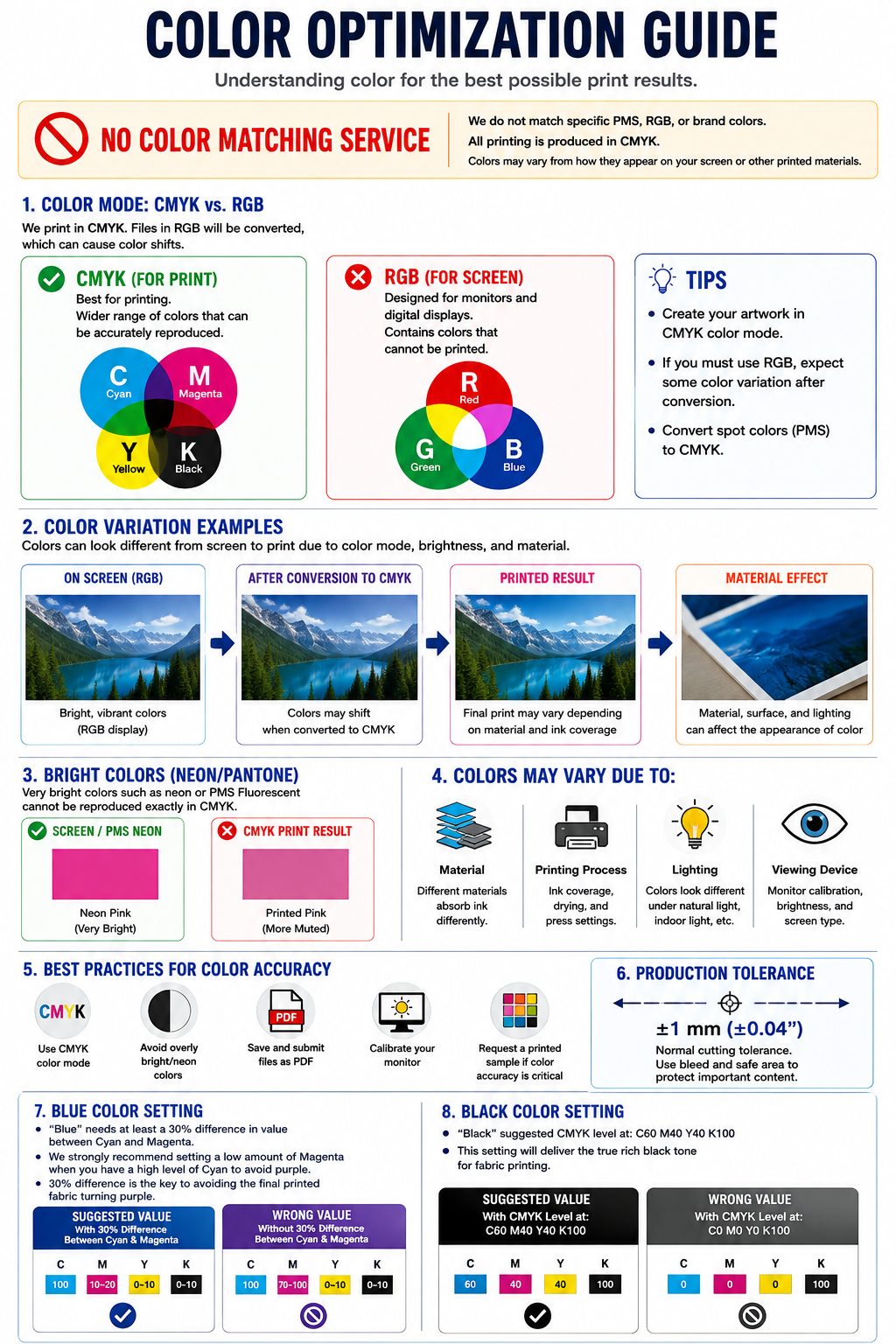
Proper color setup is essential for achieving the best possible results in professional printing. Colors displayed on a computer monitor, phone, or tablet may look different when printed because digital screens and printing equipment reproduce color differently.
777 SIGN produces printed products using the CMYK color process. Please review the following color optimization guidelines before submitting your artwork.
No Color Matching Service
777 SIGN does not provide color matching services.
We do not match specific PMS, Pantone, RGB, HEX, brand colors, previously printed products, physical samples, or colors displayed on a monitor or mobile device.
All printing is produced using CMYK values contained in the submitted artwork. Exact color reproduction cannot be guaranteed.
Normal color variation between your screen, previous prints, different materials, different production runs, and the final printed product is expected and is not considered a printing defect.
Printing in CMYK
CMYK stands for Cyan, Magenta, Yellow, and Black. These four ink colors are combined during the printing process to reproduce the colors contained in your artwork.
For the most predictable printing results, artwork should be designed and submitted in CMYK color mode.
- Create artwork in CMYK color mode whenever possible.
- Use CMYK values for important colors.
- Convert RGB colors to CMYK before submitting your artwork.
- Convert PMS or Pantone spot colors to CMYK before submitting your artwork.
- Review the converted artwork for unexpected color changes.
CMYK vs. RGB
CMYK is for printing.
CMYK is a subtractive color system designed for printing. Cyan, Magenta, Yellow, and Black inks are combined to reproduce printed colors.
RGB is for screens.
RGB stands for Red, Green, and Blue. RGB colors are created using light and are intended primarily for digital displays such as computers, phones, televisions, and tablets.
RGB can display colors that cannot be reproduced exactly with CMYK ink.
What Happens If My File Is RGB?
RGB artwork must ultimately be reproduced using CMYK inks. When colors are converted from RGB to CMYK, some colors may change in appearance.
Color changes are especially noticeable with:
- Very bright blues
- Bright greens
- Neon colors
- Fluorescent colors
- Highly saturated pinks and purples
- Very bright oranges
We strongly recommend converting your artwork to CMYK before uploading so you can review the converted colors before submitting the order.
Screen Color vs. Printed Color
A computer screen produces color using light, while printed products reproduce color using ink on a physical material. Because these are different color reproduction methods, your printed product should not be expected to look exactly like your monitor.
Screen appearance can also vary depending on:
- Monitor calibration
- Screen brightness
- Display technology
- Phone or tablet model
- Color profile
- Viewing environment
Colors May Vary Between Materials
The same CMYK artwork can appear different when printed on different materials. Each substrate has different surface characteristics, whiteness, texture, gloss level, and ink absorption.
For example, the same artwork may appear slightly different when printed on:
- Vinyl
- Banner material
- Fabric
- Paper
- Coroplast
- PVC
- Foam board
- Other rigid substrates
Colors from different materials should not be expected to match exactly.
Other Factors That Affect Printed Color
Printed color can be affected by many variables during production and viewing, including:
- Material or substrate
- Ink coverage
- Printing equipment
- Printing process
- Production environment
- Surface finish
- Indoor lighting
- Outdoor lighting
- Viewing angle
- Monitor calibration and brightness
Pantone, PMS, Spot Colors, and Brand Colors
Pantone Matching System (PMS) and other spot-color systems specify standardized colors that may require specially mixed inks or dedicated spot-color printing processes.
777 SIGN does not print using PMS or Pantone spot-color matching and does not guarantee reproduction of a specific brand color.
If your artwork contains PMS or Pantone colors, we recommend converting them to CMYK before submitting your files and reviewing the resulting CMYK appearance.
Bright, Neon, and Fluorescent Colors
Extremely bright RGB, neon, fluorescent, and certain Pantone colors cannot be reproduced exactly with standard CMYK printing.
These colors may appear more muted, darker, or less saturated when converted to CMYK and printed.
Avoid using extremely bright RGB or neon colors when an exact printed appearance is required.
Blue Color Setting
Blue is one of the colors most commonly affected by CMYK values. If Cyan and Magenta values are too close together, the final printed blue may appear purple.
- Blue should have at least a 30% difference between Cyan and Magenta.
- We strongly recommend using a lower amount of Magenta when the Cyan value is high.
- Maintaining approximately a 30% or greater difference helps reduce the possibility of blue printing with a purple appearance.
Suggested Blue Example
A blue containing a high Cyan value should use substantially less Magenta so that there is at least a 30% separation between the two values.
Recommended direction: High Cyan + Lower Magenta
Avoid: High Cyan + High Magenta with less than approximately 30% separation, which may create a purple-looking printed result.
Black Color Setting
Using only 100% Black (K100) can sometimes produce a black that appears less deep or less saturated across large printed areas, especially on fabric products.
Recommended Rich Black for Fabric: C60 M40 Y40 K100
This CMYK combination is recommended for achieving a deeper, richer black appearance on fabric printing.
Suggested: C60 M40 Y40 K100
Not recommended for large rich-black fabric areas: C0 M0 Y0 K100
Black Text and Fine Details
For small black text, thin lines, and fine details, 100% Black (K100) may be preferable because using multiple CMYK channels on very small elements can increase the possibility of visible registration differences.
Total Ink Coverage
Total ink coverage is the combined percentage of Cyan, Magenta, Yellow, and Black used in a color.
Extremely high combined CMYK values can result in excessive ink coverage and may contribute to drying, smudging, color, or print-quality issues on certain products.
Avoid unnecessarily using maximum values in all four CMYK channels.
Gradients and Shading
Gradients contain gradual changes from one color or shade to another. Very subtle gradients, extremely dark gradients, or gradients created across a very short distance may show visible transitions or banding when printed.
For better gradient results:
- Use smooth color transitions.
- Avoid unnecessarily complicated gradient effects.
- Avoid extremely small tonal differences over large areas.
- Review gradients after converting your artwork to CMYK.
Image Resolution and Color Quality
Image resolution does not directly control CMYK color values, but low-resolution images can make printed colors and details appear soft, pixelated, or unclear.
Always prepare artwork at an appropriate resolution for the final printed size and intended viewing distance.
- Use high-resolution source images whenever possible.
- Do not enlarge small raster images excessively.
- Review your artwork at final production size before submitting.
- Save your final artwork using a high-quality or press-quality PDF setting when possible.
Best Practices for Better Printed Color
- Design your artwork in CMYK color mode.
- Convert RGB artwork to CMYK before submitting.
- Convert PMS and Pantone spot colors to CMYK.
- Avoid extremely bright RGB, neon, or fluorescent colors.
- Use appropriate CMYK values for blue.
- Use rich black appropriately for large black areas.
- Use 100% K for small black text and fine details when appropriate.
- Use high-resolution images.
- Review gradients carefully.
- Calibrate your monitor if color accuracy is important to your workflow.
- Save and submit print-ready PDF files.
Before Submitting Your Artwork
Please review the following color preparation checklist before uploading your artwork:
- Artwork is prepared in CMYK color mode.
- RGB colors have been reviewed or converted to CMYK.
- PMS and Pantone colors have been converted to CMYK.
- Important blue colors have sufficient separation between Cyan and Magenta.
- Large black fabric areas use an appropriate rich-black setting.
- Extremely bright, neon, or fluorescent colors have been reviewed.
- Images are high enough resolution for the final production size.
- Text and important design elements are legible.
- Gradients have been reviewed for smooth transitions.
- Final artwork has been carefully reviewed before submission.
- Artwork has been saved as a print-ready PDF.
Important Color Disclaimer
Colors displayed on your monitor, phone, tablet, or other electronic device are not an accurate representation of the final printed product.
Final printed colors may vary due to CMYK conversion, printing equipment, ink, material, production conditions, lighting, surface characteristics, and other normal manufacturing variables.
777 SIGN does not provide PMS, Pantone, RGB, HEX, brand-color, sample-color, or previous-order color matching.
Following this guide can help improve color consistency and reduce unexpected color shifts, but it does not guarantee an exact color match.
By submitting your artwork for production, you acknowledge that normal color variation is inherent in the printing process.